California NDVI Anomaly Viewer
An interactive web application that visualizes how stressed California's vegetation is compared to a 6-year historical baseline. Based on MODIS satellite composites updated as frequently as every 16 days. Click anywhere in California to get the exact vegetation stress score and drought classification for that location.
What It Shows
The map displays an NDVI anomaly heatmap showing whether vegetation across California is more or less healthy than the historical average for the most recent satellite composite period. Red means stressed, green means above normal, yellow means near normal. Because MODIS composites are typically published 2–4 weeks after acquisition, the data may lag the current calendar month by one or more months.
Clicking inside the California boundary returns the exact anomaly score for that pixel, and the current US Drought Monitor classification for that county.
Understanding the Data
What is NDVI?
NDVI (Normalized Difference Vegetation Index) is a simple mathematical formula that quantifies vegetation health using satellite data. It compares how much near-infrared light plants reflect versus red light they absorb. Healthy vegetation absorbs red light for photosynthesis but reflects most near-infrared light. The result is a number ranging from −1 (dense water, pavement, snow) to +1 (dense, healthy vegetation).
Most of California's land ranges between 0.2 and 0.8 depending on season and land cover: forests are typically 0.6–0.8, grasslands 0.3–0.6, deserts 0.0–0.2, and water or urban areas below 0.0.
What is an Anomaly?
An anomaly reveals how different today's vegetation is from what's normally expected for that location and time of year. It's calculated using the current NDVI minus historical average NDVI for the same month's data.
A +0.1 anomaly means vegetation is about 10% healthier than average. A −0.1 means it's about 10% more stressed than average. Zero means perfectly normal. The map uses a red-yellow-green color scale: red for negative anomalies (stressed), green for positive (above normal), yellow for near zero (normal).
How is "normal" defined?
For each month, a 6-year historical baseline (2018–2023) was computed by averaging all available MODIS observations from that calendar month. This was done to account for seasonal patterns. For example, Sierra Nevada vegetation is naturally sparse in winter due to snowpack but thrives in summer, while the Central Valley exhibits the opposite pattern. Comparing against the correct month ensures the anomaly reflects true stress, not seasonal variation.
How It Works
The data pipeline runs in three phases: building the baseline Cloud-optimized Geotiffs (COGs), attempting to update the anomaly every 16 days as new MODIS data arrives, and serving both the map and click analysis from a single live web application.
Six years of MODIS NDVI data (2018–2023) are processed for California, grouped by calendar month. For each month, all available scenes are averaged pixel-by-pixel to create a "normal" NDVI reference. This produces 12 baseline files, one per calendar month, that capture inherent seasonal patterns: winter snow in the mountains, spring greening in valleys, summer stress in deserts, etc. These baselines remain static and define what "healthy" means at each location for each month of the year.
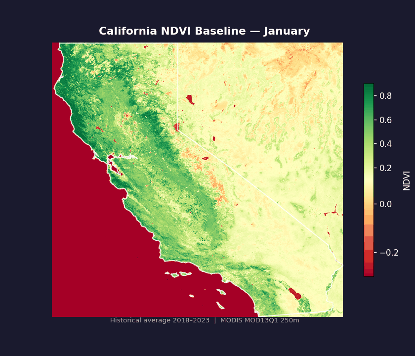
Each frame shows one calendar month's 6-year historical average NDVI. Winter snow suppresses vegetation in the Sierra Nevada and high elevations; the Central Valley peaks in late spring; coastal chaparral and deserts show much lower NDVI year-round. These 12 reference maps are what "normal" looks like at each location for each month. Any current MODIS scene is compared against its corresponding month's baseline to compute the anomaly.
When new MODIS data arrives (typically every 16 days) a script fetches the latest composite and determines which calendar month it belongs to. The corresponding monthly baseline is subtracted pixel-by-pixel to produce an anomaly grid: positive values where vegetation is healthier than normal, negative where it's stressed. Because MODIS composites are published 2–4 weeks after acquisition, the latest data often reflects conditions from a previous month. The baseline comparison always matches the data's actual month, not today's date.
The live anomaly data is served as map tiles clipped to the California boundary. When you zoom and pan the map, only the visible region is fetched and rendered in real time, using the anomaly values to color each pixel. No pre-rendering or tile cache. If new MODIS data arrives and the anomaly updates, the map shows the new data. This keeps the visualization current and eliminates the need for manual updates.
When you click on the map, the exact anomaly value at that pixel is retrieved from the same live anomaly dataset. The location is also reverse-geocoded to determine the county, which is then used to fetch the current US Drought Monitor classification. The sidebar combines all this data into a plain-language assessment: stress level, anomaly value, and drought category. All requests hit the same underlying anomaly file, so the map color and the sidebar value always match.
Key Technical Decisions and Rationale
MODIS has 20+ years of continuous NDVI data at 250m resolution. Sentinel-2 is higher resolution (10m) but only available since 2017 and has more complex cloud handling. Using the same sensor family for baseline and current data avoids cross-sensor calibration issues.
The USDM REST API only supports area queries meaning there is no point query endpoint. To work around this, I reverse-geocode the clicked coordinate to a county FIPS code via the Census Bureau API, then query USDM with that FIPS code.
Known Limitations
MODIS does not include a water mask. Lakes, reservoirs, and ocean reflectance will produce NDVI values, but these do not reflect vegetation health. Examples: the Salton Sea, Lake Tahoe, major reservoirs, and coastal pixels show anomaly values that should be disregarded.
MODIS composites are published 2–4 weeks after satellite data collection. The map header always displays the exact scene date and baseline month so you know what period the data represents. Latest data often reflects conditions from a prior calendar month.
Each MODIS pixel covers 250×250 meters (roughly 6 acres). Fine-scale patterns like individual orchards, urban/rural edges, and riparian corridors smaller than this footprint cannot be resolved. Click analysis samples a 3×3 window (~750m) of pixels and averages valid values.
Tech Stack
This tool provides indicative vegetation stress assessment based on satellite and environmental data. It is a portfolio and research project combining publicly available MODIS data with US Drought Monitor information. It does not incorporate real-time weather, fire behavior modeling, or other emergency-specific datasets, and should not be used for emergency management, insurance decisions, or critical operational planning.